 The Author: Anne Golombek
Anne Golombek is COO and Marketing Lead at minubo, the Commerce Intelligence Company. As an expert in data-driven commerce, she is one of the initiators of the Commerce Reporting Standard project.
 After introducing the Business Vitality Model in our first article, we’ll now go into a little more detail on model derivation, method and implementation – and shed some light on what’s to come in our third article as well as the upcoming workshop:
- Derivation: How we came up with the model and what’s its basic idea and structure
- Method: Why cohort view is the best method to look at business drivers
- Implementation: How to conduct the business vitality analysis
- Outlook: A taste of what’s to come in our third article and the upcoming workshop
To contribute your own ideas to the discussions, don’t forget to sign up for our workshop in the Project A offices in Berlin: November 8th 2018, 10am-5pm.
1) Derivation: In Search of a Meaningful Model
In our previous article, we already described the basic ideas that brought us to the Business Vitality Model – let’s pick up on the most important thoughts we outlined there to get started with the first part of our deep dive: The derivation of our model.
The online revolution has not only changed our sales frontends – it has turned the complete system upside down. Today, it’s all about the customer and his or her expectations; retailers and their assortments are no longer the centre of commerce. Consequently, financial analysis and planning have to change accordingly: In a customer-centric world, management models have to be built on customer KPIs as these are the actual drivers of today’s commerce businesses. Only by looking at historical patterns in customer KPI development, valid statements can be made not only on past and current business performance, but also in terms of forecasting: Plan figures derived from historical patterns are the baseline for your planning – if you now add the impact of strategic measures you want to implement (directly verifiable as with the historical development of your key business drivers you have a basis for validation right at hand), you’ll get a watertight business forecast. But heads up: To end up with a model that is actually suitable for business requirements, you’ll also need a direct connection to your P&L, as that’s where performance and plan figures ultimately reside. Hence, in search of a meaningful model, these were our basic requirements:
- The model has to be based on relevant customer and cost KPIs with direct connection to P&L (see section 1 – next paragraph)
- The model has to provide a meaningful historical view… (see section 2)
- …to be able to forecast changes based on past patterns (article 3)
- The model has to deliver transparency on the impact of strategic measures (article 3)
Starting with the KPIs we consider relevant to match requirement 1 in both aspects, we ended up with the following metrics portfolio – derived from our transaction metrics matrix that provides the connection to your P&L:
a) Customer & Revenue Metrics
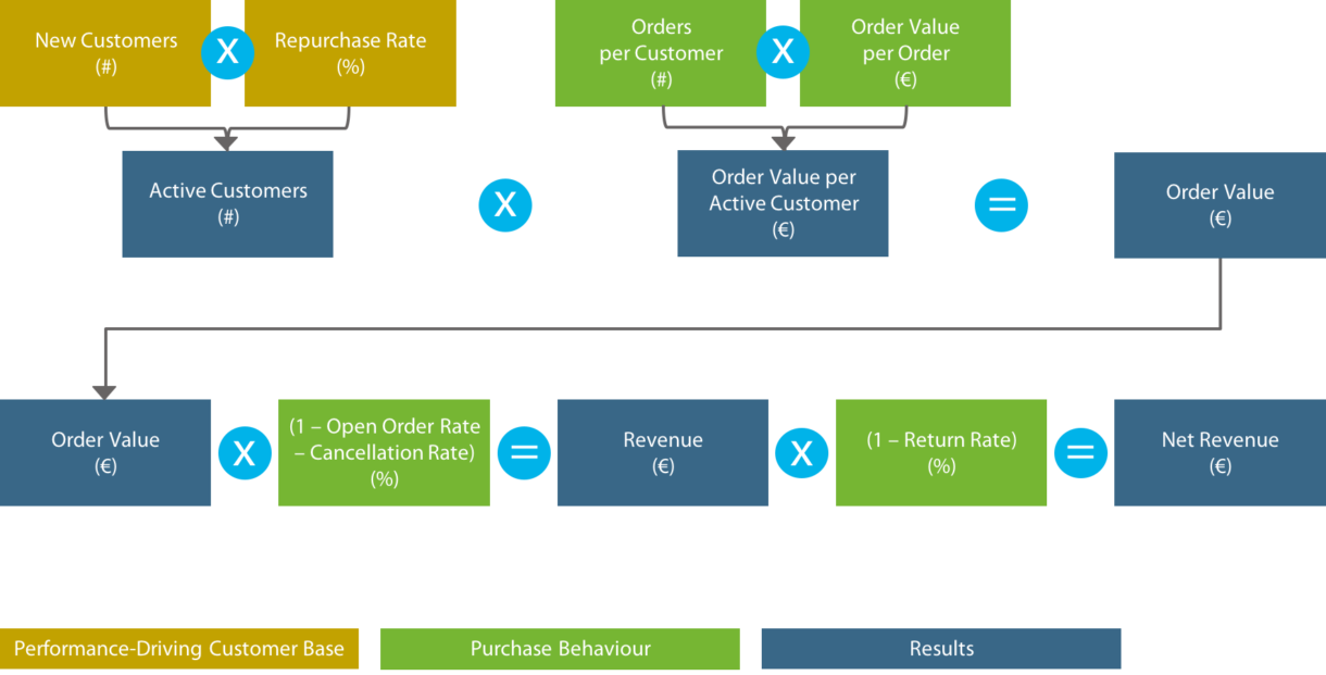
Image 1: Customer and revenue metrics
b) Cost Metrics
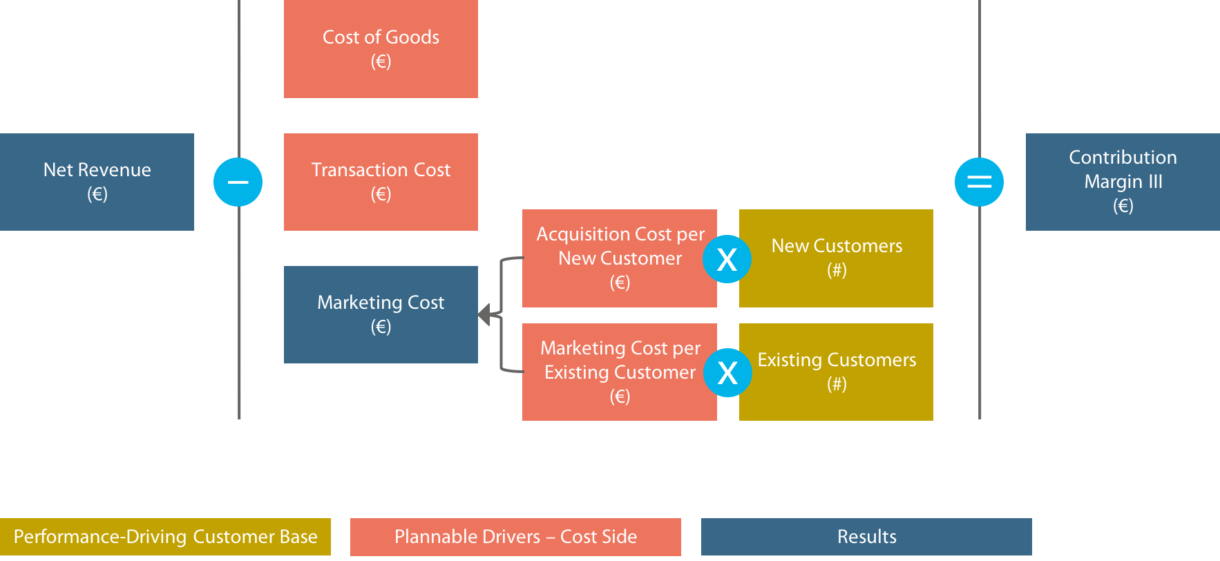
Image 2: Cost Metrics
For details on metric definitions, click here.
With that basis of metrics at hand (a portfolio that can/should be expanded for operational use cases – see section 4), it was now about finding a method that presents these metrics in a relevant, insightful way – a method that, at the same time, doesn’t become to fragmented by offering individually optimized ways of analysis for each metric, but delivers one holistic analytical approach in order to ensure consistency of results as well as their comparability. Only with that given, a meaningful historical view of the relevant business drivers can be provided that paints a holistic picture of the company’s past and present performance (requirement 2) and is able to deliver solid forecasts (requirement 3) that can depict the impact of strategic measures for every business area (requirement 4).
2) Method: The Power of Cohorts
The nice thing about cohorts consists in the fact that they take the abstractness out of development reports. As with cohorts, you break analytical quantities (as in our case, your total customer base) down into groups by a time-related attribute that usually has a high relevance in their performance history (as in our case, the year of a customer’s first purchase), you take the crucial level of aggregation out of your analytical view – allowing you to obtain true transparency when looking at development figures. The decisive difference compared to other analytical forms: Looking at annual customer cohorts, you see the development of a group of customers who have actually developed together. Under the same (or nearly the same) circumstances, with the same (or nearly the same) parameters accompanying them. With your cohorts defined, you follow them as the same, unaltered groups of people – not letting new buyers who broaden the total customer base from year to year dilute the explanatory power of your development figures. Wouldn’t that increase the insightfulness of your development reports significantly? It would. (Just remember the very simple rule of thumb that you’ve surely heard before: Averages hide stuff! They really do. See what happens in the picture below.) And even better: Cohort views do not only boost transparency, but also increase the conclusiveness of the gathered insights, as it’s a lot easier to find connections to key development drivers with them than with aggregated development figures.

That’s why we decided that cohorts are the one and only way to truly x-ray your business – and made them the basis of our model.
Two Forms of Presentation: Cohorts in Calendar View vs. Cohorts in Life Year View
Let’s start with the classic cohort view that you’ve probably seen many times before – we call it “cohorts in calendar year view”:
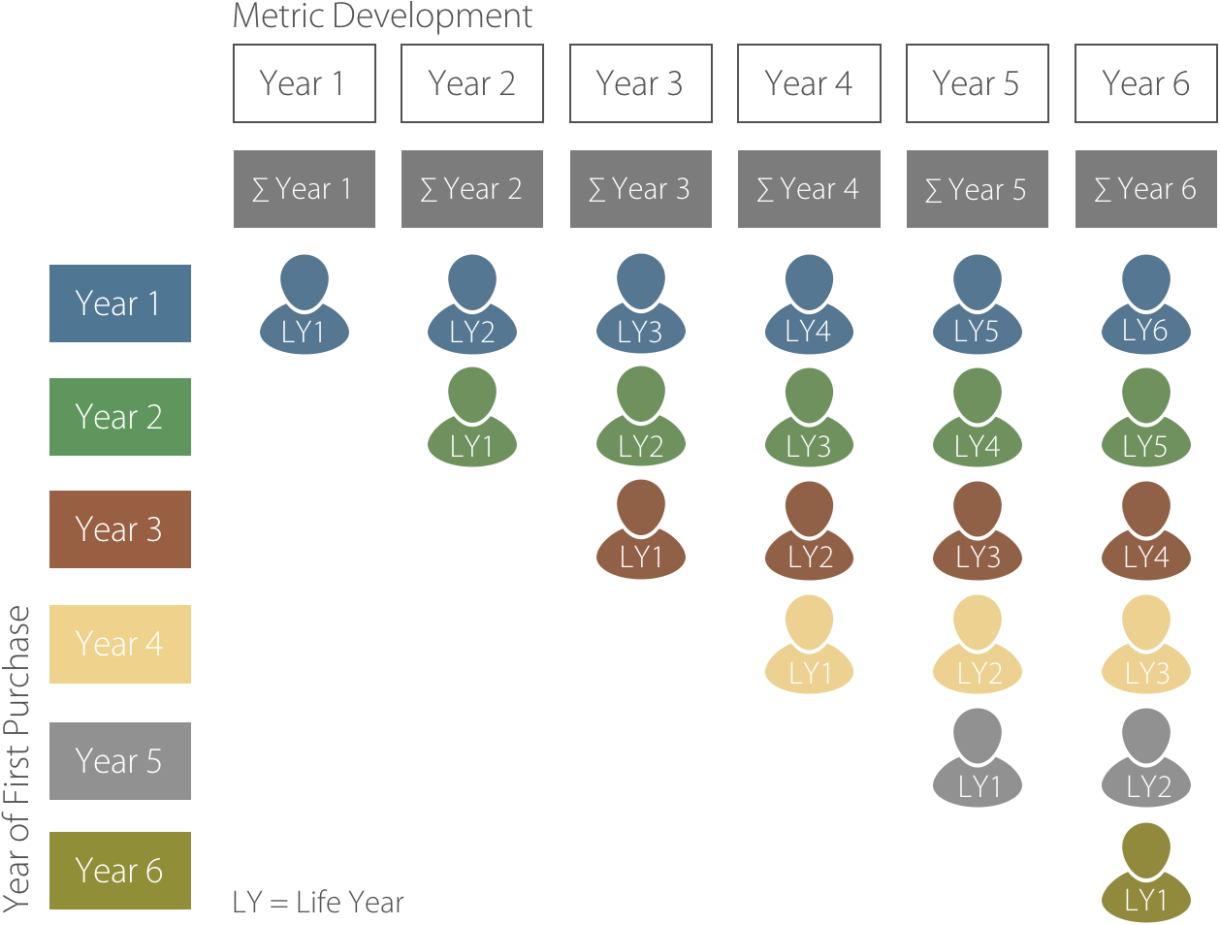
Image 3: Annual customer cohorts in calendar year view
You could describe that view like this: Events (in our case: a customer’s first purchase) are displayed in the calendar year they occurred (x-axis).
But instead of comparing and aggregating the development metrics of annual customer cohorts in terms of calendar years, you can also compare and aggregate them in life year view; meaning that you compare the values of a cohort’s first life year with the values of the other cohorts’ first life year – with no regard to the fact that it’s not the same calendar year we’re talking about. With that kind of view, it might get even easier to extract the most relevant insights from your analysis:
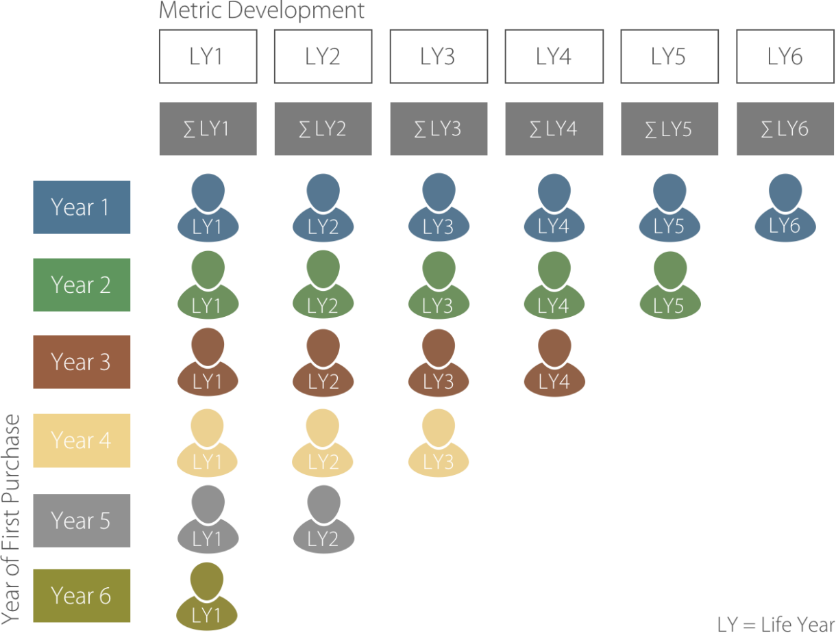
Image 4: Annual customer cohorts in life year view
For understanding and implementing the Business Vitality Model, it’s important to know both kinds of views for different kinds of insights you want to gather.
3) Implementation: Metric Breakdown & Visualization
So now, we have the basics straight: We know the relevant metrics (section 1) and we know the method we’ll apply (section 2). All that’s left to do now is to break down our annual customer cohorts across all the relevant metrics we identified – and have a closer look at how to visualize our analyses to maximize their insightfulness.
As described in article one, you best start with the basics:
- Number of customers
- Repurchase rate
Let’s look at the samples from article 1 again:
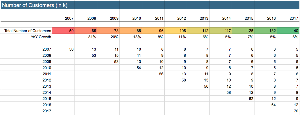
Image 5: Number of customers in calendar year view
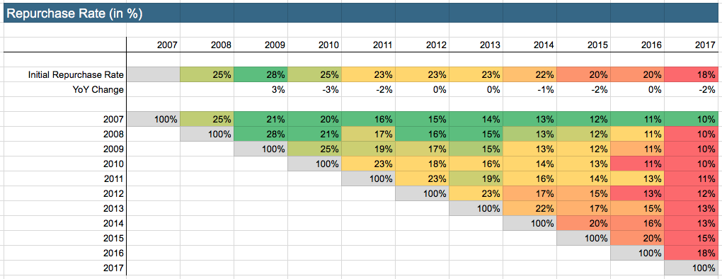
Image 6: Repurchase rate in calendar year view
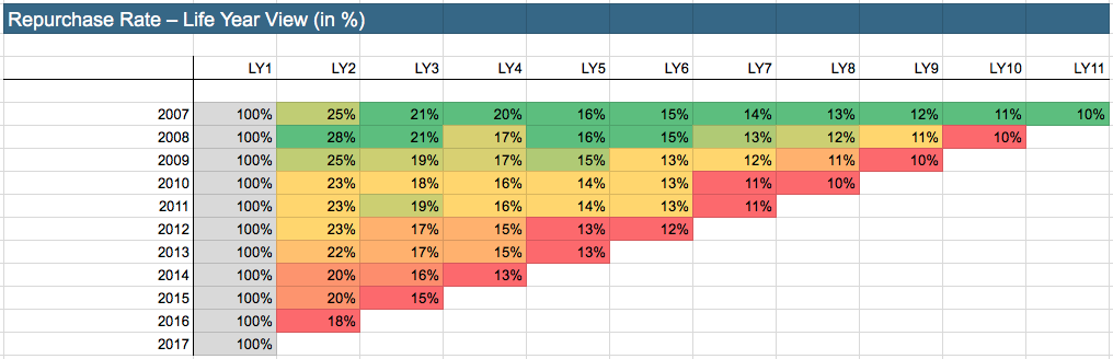
Image 7: Repurchase rate in life year view
To further increase explanatory power, we recommend to also look at your repurchase rates in life year view in the form of a line chart – comparison of cohort performance gets even more transparent with that as you see how values deviate from each other in every life year:
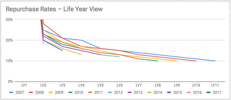
Image 8: Repurchase rate in life year view – line chart visualization
Another useful effect of this view is that it works like kind of an early-warning system: If business drivers develop negatively, you’ll recognize it early on. You can then derive a forecast for the upcoming years and develop strategic measures to improve performance (requirement 3 and 4 – more about that in article 3).
A useful step of visualization can also be to turn the analysis upside down (cohorts on the x-axis, repurchase rates on the y-axis) and visualize the course of the most important life years (the ones with significantly higher repurchase rates [= higher revenues] than the rest of the life years – e.g. life year 2-4), so the deviations between the performance of the single cohorts become even clearer:
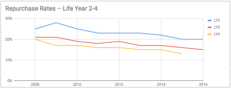
Image 9: Repurchase rates in life year 2-4 – across all cohorts
As already stated in article one: In our sample case, it becomes evident that cohort performance in terms of sustainable business value significantly decreases over the course of the years – a development that has to be stopped as soon as possible (unless you are funded so well that you can afford to finance this expensive experiment).
To broaden your insight, you can now go through all the defined metrics (image 1 and 2) and break your cohorts down across them. Here are all the basic metrics again that we recommend for a start – this time as a list, so they become a little easier to extract:
- Number of customers
- Repurchase rate
- Orders per customer
- Order value per order
- Order value per active customer
- Order value
- Cancellations
- Revenue
- Return rate
- Net revenue
- Net revenue per customer
- Direct cost per customer (cost of goods + transaction cost)
- Marketing cost per customer
- Contribution margin III per customer
- Contribution margin III
Based on these cohorts, you can always derive some interesting aggregated figures in various ways – depending on what kind of insight you’re interested in. For example, it makes sense for most of the cohort views to not only aggregate the numbers per calendar year in total, but also split up into new and existing customers.
4) Outlook: Next Article and Workshop
If you got to that point with the analysis, you can go into multiple directions: Extract insights for a performance review of the current year, forecast future years’ development based on your historical patterns and strategic measures you plan to implement, expand the list of metrics to dig deeper into single operational topics (e.g. shopping carts: items ordered, order value per item…), gather benchmark figures and compare your performance to the performance of your peers… the list of possibilities is long. We’ll have a closer look at some of these topics in article 3:
- Forecasting
- Impact of strategic measures
- Scenario analyses
- Breakdown to the operational level
- Benchmarking
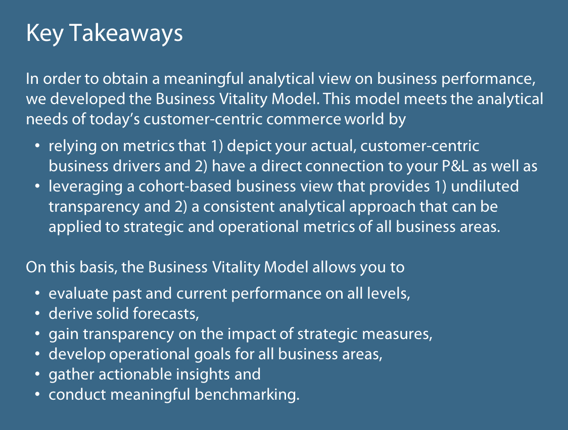
Now, it’s Your Turn!
First: Discuss With us – Online or in our Workshop!
What do you think about these ideas? Don’t hesitate to share your thoughts – via the comment section below or in person during our workshop about the Business Vitality Model:
November 8th, 2018 – 10am–5pm
Project A offices, Berlin

Second: Have Your Own Business Analyzed!
What do your own numbers have to tell you? We offer to run the Business Vitality Model for you – first two signups get the analysis for free! Just register via our form and we’ll get in touch with you shortly.